
Most Shopify stores don't need a new brand. They need the right things on the first screen of a phone. These are the checks I run on a store before I redesign anything.
01The 4 fixes I check first
0 / 4
If you only have ten minutes, do these four.

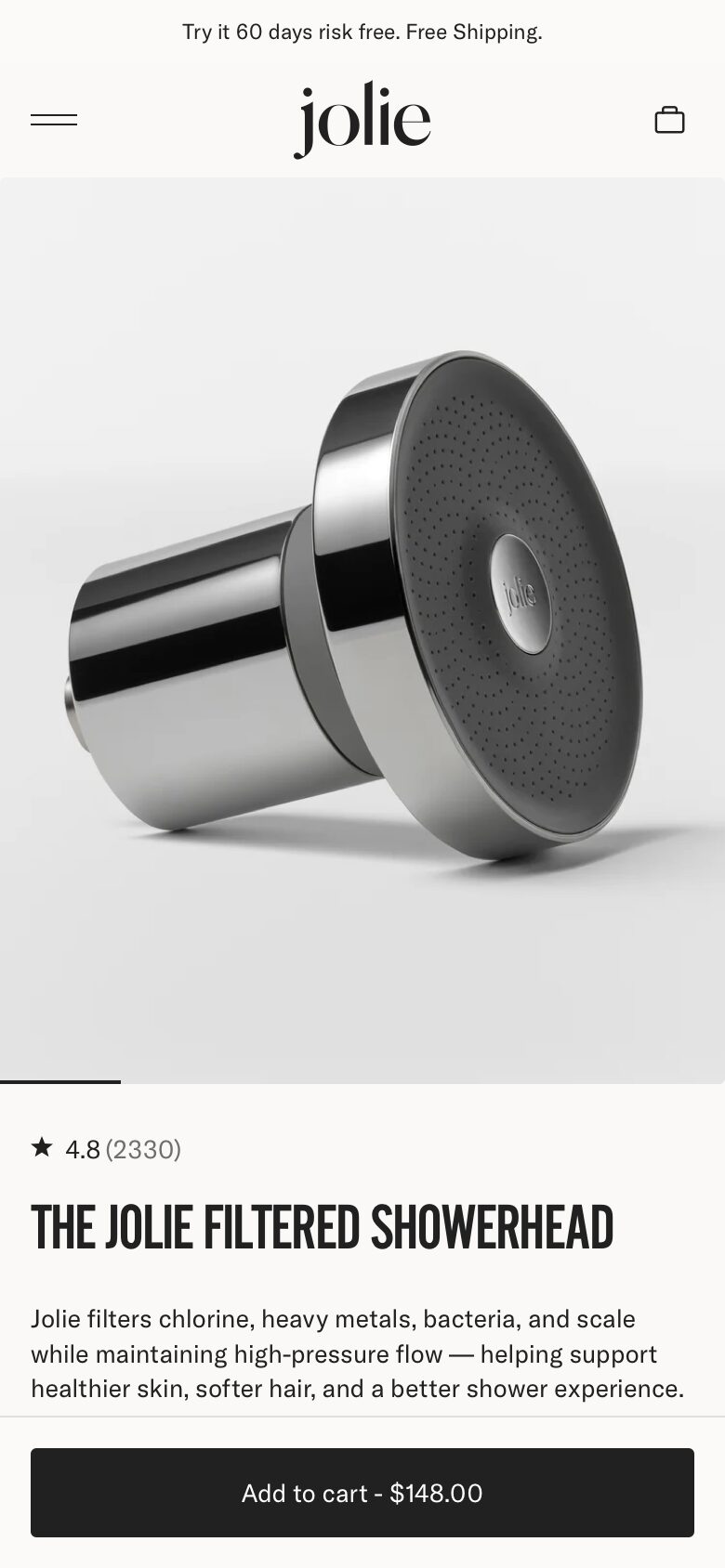

02The first screen on a phone
0 / 6
Most of your traffic is on a phone. Shopify's own design guide cites Dynamic Yield data: mobile is about 75% of visits.
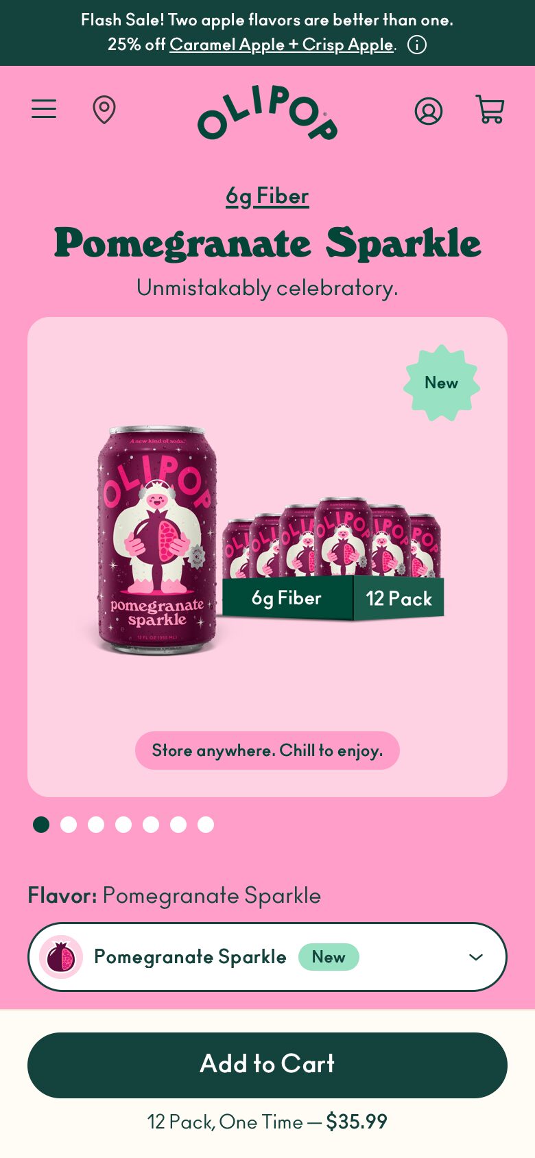
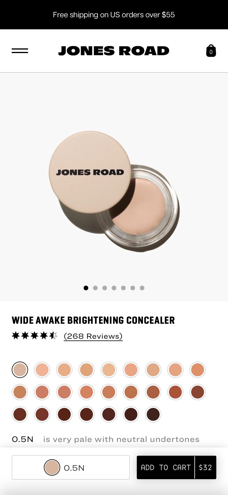


03The buy button
0 / 5




04Product info and images
0 / 8
Baymard's research, cited by Shopify, found 56% of shoppers go straight to the images.




05Reviews and proof
0 / 9




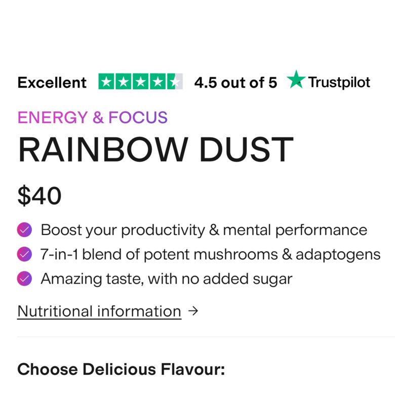
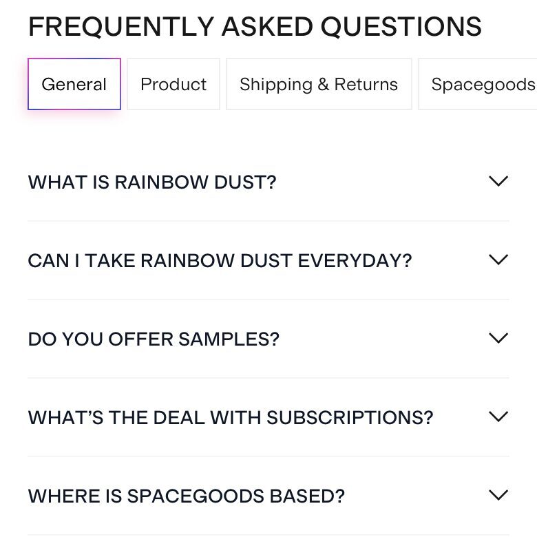

06Order value: bundles, cart, checkout
0 / 7
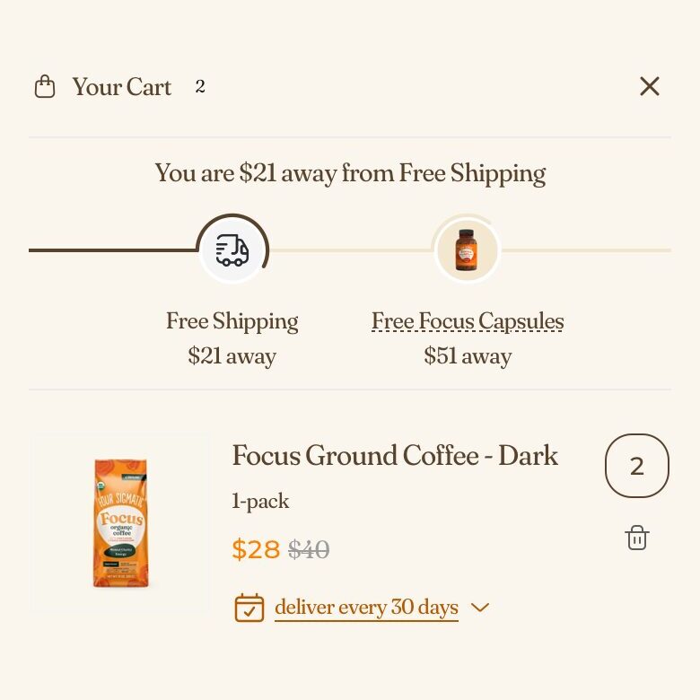
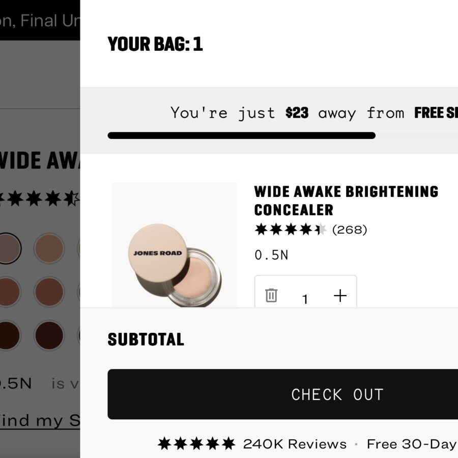
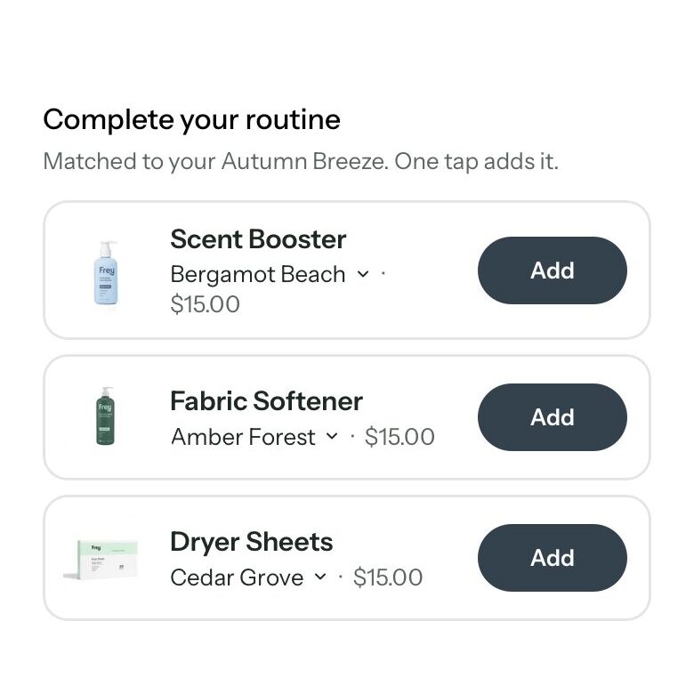
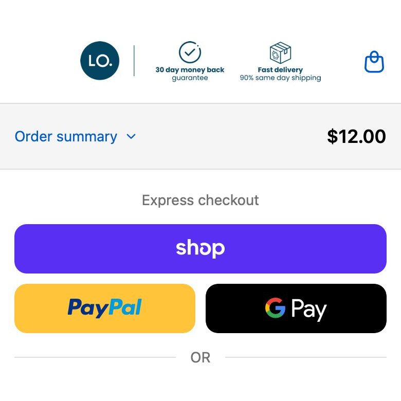
You already paid to get this visitor. These checks make each order worth more.


07Speed
0 / 4

08Collection pages
0 / 5
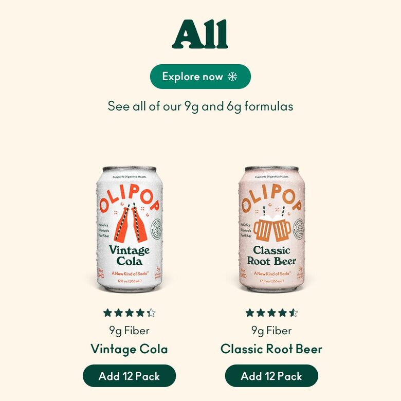
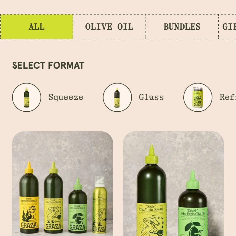
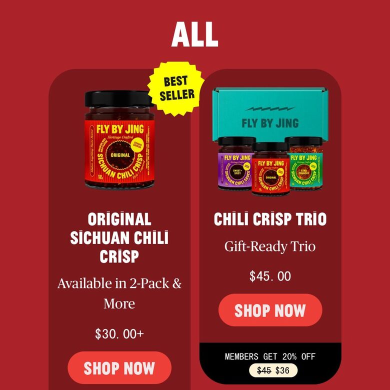
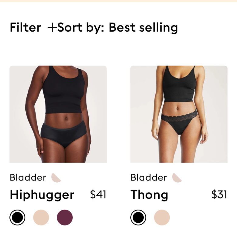
A collection page has two jobs: show the products, and help people narrow them down.
09Homepage
0 / 7
Most homepages don't have a traffic problem. They have a clarity problem.








10What not to copy from dropshipping tutorials
Have you noticed that half the YouTube tutorials on Shopify design are actually made for dropshippers? These tips would hurt a real brand:
- Importing reviews from AliExpress or Amazon for a product that isn't yours. Your customers will find out.
- AI-made reviews and customer photos, or before-and-afters pulled from Google. One screenshot in a Reddit thread and the trust is gone.
- Countdown timers that reset and "only 3 left" when it isn't true. Daniel Budai says shoppers are now very sceptical of these. Real scarcity works: real stock levels, a real end date.
- Price tricks, like making the compare-at price bigger than the real one so it looks cheaper.
- Testing button colours before the offer and the message are right. Sabri Suby calls button colour a "one-percenter". Fix the hook and the offer first.
11How to test a change
The maths is why this matters. 10,000 visitors a month at a 2% conversion rate is 200 orders. At 4% it's 400 orders, from the same traffic and the same ad spend.
- Change one thing at a time. Change three and you won't know which one worked.
- Give it at least two weeks and about 100 orders per version before you call a winner. With fewer, the result is mostly luck. Shopify's own tool is Rollouts; Shoplift, Intelligems and VWO also work.
- Watch revenue per visitor, not only conversion rate. A higher conversion rate that lowers your order value can leave you worse off.
- Check the traffic before you blame the page. In one Shopify example, a $30 gap in order value between two page versions turned out to be a weak ad sending poor traffic.
Sources
- The $1M Product Page Formula, Shopioso
- I Studied 100+ Shopify Product Pages, Shopioso
- How To Design High Converting Product Pages in 2025, Daniel Budai
- How To 4X Your Shopify Conversion Rate, Davie Fogarty
- How To 2-3X Conversions Of ANY Ecommerce Funnel, Sabri Suby
- How To Create A High-Converting Shopify Product Page, Freedom Club
- How to Create a High Converting Product Page on Shopify (2026), Judge.me
- How to Build a High-Converting Shopify Homepage, My First Website
- The Most Important Shopify Page You're Not Optimizing (collection pages), Oliver Kenyon, ConversionWise
- High-converting landing pages, Shopify blog
- Ecommerce website design: 20 examples and tips, Shopify blog
- How Online Reviews Influence Sales, Spiegel Research Center, Northwestern University
- New Industry Benchmarks for Mobile Page Speed, Think with Google
- How Long Do Users Stay on Web Pages?, Nielsen Norman Group
- Banner Blindness Revisited: Users Dodge Ads on Mobile and Desktop, Nielsen Norman Group
- Von Restorff Effect, Laws of UX
- Fuzzy Math: What Makes Something Seem Like a Good Deal?, Jonah Berger
- Ensure Sufficient Image Resolution and Zoom, Baymard Institute
- Pennies-a-Day: The Effect of Temporal Reframing on Transaction Evaluation, John T. Gourville, Journal of Consumer Research
- L.L.Bean Eliminates Legendary Lifetime Returns Policy, Providence Business News
- The Goal-Gradient Hypothesis Resurrected, Kivetz, Urminsky and Zheng, Journal of Marketing Research
- When Choice Is Demotivating: Can One Desire Too Much of a Good Thing?, Iyengar and Lepper
- Milliseconds Make Millions, Google and Deloitte Digital
- Driving User Growth with Performance Improvements, Pinterest Engineering
- Hick's Law, Laws of UX
- Effects of Supply and Demand on Ratings of Object Value, Worchel, Lee and Adewole, Journal of Personality and Social Psychology
- The Nuances of the FREE! Experiment, Dan Ariely
- Web Users Judge Sites in the Blink of an Eye, Nature News